Basics of Matplotlib
In this tutorial, I’ll be going through the basics of using MatPlotLib.
We’ll learn some of the building blocks of MPL: Figures, Artists, Axes, Axis.
Importing
| |
Figures
The main primitive of MPL is a figure. A figure is an object class that contains a lot of methods that we can use to plot figures. In the words of MPL, a figure is a ’top level Artist’ that holds all plot elements. What is an artist?? I hear you say.
Artist
An ‘Artist’ is a base class for objects that render into a FigureCanvas - basically everything visible on a figure is an artist - even Figure, Axes, and Axis objects. Text objects, collections, are all artists.
When the Figure is rendered, all Artists are drawn to the canvas. Most Artists are tied to an Axes; such an Artist cannot be shared by multiple Axes, or moved from one to another.
Creating Figures
To create an empty figure, we do
| |
<Figure size 432x288 with 0 Axes>
To add a single Axes:
| |
It is worth looking at the fig, ax = ... syntax. This is similar to destructuring in Javascript, where the RHS evaluates to an array or tuple of two items, which is assigned to fig and ax respectively.
To illustrate
| |
<AxesSubplot:>
tells us that ax is an AxesSubplot object, whereas
| |

returns a figure with type
| |
matplotlib.figure.Figure
To create a figure with a 2x2 grid:
| |
Axes
An axes is an artist attached to a figure. Usually, graphs come with two Axis objects that provide ticks and tick labels to provide scales for the data.
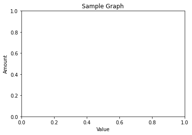
Each Axes also has a title, set via set_title(), and an x-label and y-label set via set_xlabel() and set_ylabel() respectively.
| |
Text(0.5, 1.0, 'Sample Graph')
| |
| |
Text(0.5, 3.1999999999999993, 'Value')
| |
Text(3.200000000000003, 0.5, 'Amount')
| |
The main point to note here is that anything that’s got to do with adjusting Axes info, you perform operations on the ax object.
This includes, setting title of graph, labels.
Axis
On the other hand, we have Axis objects, which set the scale and limits and generate ticks and ticklabels. This is different from the Axes object.
Input types for plotting functions
To plot data, we need to supply the raw data to be plotted. The plotting functions of MPL .plot() expects data of certain type.
- numpy arrays
- array-like objects like pandas data objects (but may not work as intended)
Common convention is to convert Dataframes into numpy arrays b4 plotting.
Most methods will also parse objects like dict, or pd.Dataframe.
To plot, you supply data object to the data keyword of plotting methods.
e.g.
ax.scatter('a', 'b', c='c', s='d', data=data)
Two ways of plotting in MPL
1. OO Style
- explicitly create Figures and Axes,and call methods on them
| |
| |
[<matplotlib.lines.Line2D at 0x7f852804fc70>]
| |
| |
[<matplotlib.lines.Line2D at 0x7f8588590730>]
| |
| |
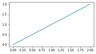
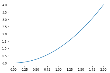
In an abstract way, you’re creating a figure, and adding ‘artist’ elements to them step by step.
plot() allows you to draw curves.
The rest of the commands are adding descriptions to figure.
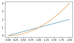
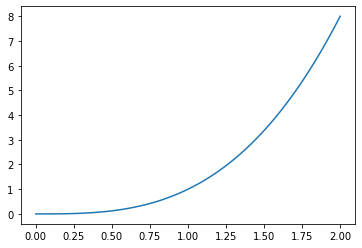
2. pyplot style
The pyplot style looks like this:
| |
| |
<Figure size 360x194.4 with 0 Axes>


<Figure size 360x194.4 with 0 Axes>
| |
[<matplotlib.lines.Line2D at 0x7f85380738b0>]
| |
[<matplotlib.lines.Line2D at 0x7f85280c0f70>]
| |
[<matplotlib.lines.Line2D at 0x7f85481125b0>]
| |
Text(0.5, 0, 'x label')
| |

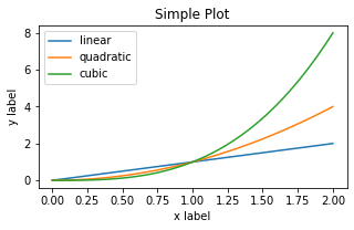
Observations
In the pyplot style, you’re kind of doing it ‘on-the-go’. In contrast to the OO style, you don’t create an object assign it to a variable. There seems to be an implicit plt object that is called and as observed above, the final figure is only produced when all the plt is executed in sequence. It’s quite strange. When I executed them one by one, nothing is /notes/20DEC_mpl_images/outputted.
In the documentation, it is advised that generally the OO style is preferred for complicated plots, and the pyplot style be used for quick, interactive works.
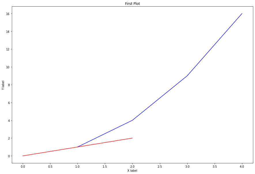
Styling lines
You can style lines of .plot() by supplying the following params: color, linewidth, linestyle.
Example:
ax.plot(x, np.cumsum(data1), color='blue', linewidth=3, linestyle='--')
| |
Styling shorthand
Alternatively, you can style your graphs by providing a third optional argument after supplying x and y arguments to .plot(), like so:
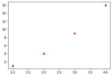
plt.plot([1,2,3,4], [1,4,9,16], "g-")
The above go will plot a green line.
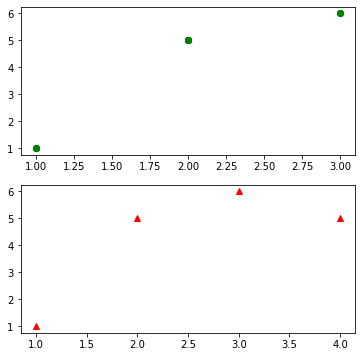
To plot blue circles, you use bo.
To plot red triangles, you use: r^.
| |
[<matplotlib.lines.Line2D at 0x7f854818ee20>]
Plotting multiple plots in one figure
We can use subplot() method to plot more than one graph in a figure.
| |
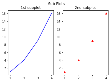
The subplot() method takes 3 arguments: nrows, ncols, and index.
In the example above, we wanted 1 row, 2 cols - so we supplied (1,2,1) and (1,2,2) into the two subplots.
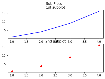
To plot horizontally stacked graphs
Simply change the row and column arguments to subplot()
| |
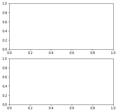
Plotting Subplots OO style
In the example above, we were plotting subplots in the pyplot style. To do so in the OO style, we can do the following:
fig, ax = plt.subplots(nrows=2, ncols=1, figsize=(6,6))
| |
Filling in data
| |
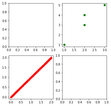
Multiple dimensions Matrix of graphs
| |
| |
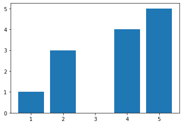
Bar Graphs
Same thing as .plot() method, but with .bar().
| |
<BarContainer object of 4 artists>
Horizontal bars are done with barh() method.
Stacked Bars
To create stacked bars, we’ll need to understand another concept. The first argument we pass to bars will be replaced by the number of bars you want to see, in the form of an array.
| |
<BarContainer object of 5 artists>
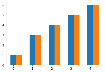
If you want to see 5 bars, supply an index of 5. Then, you simply call the .bar() method twice, and adjust the index of the second bar to be the width of your first bar. index + 0.3. This shifts the orange bar to the right.
Finally, you supply the ticks information.
| |
([<matplotlib.axis.XTick at 0x7f8568a5ff10>,
  <matplotlib.axis.XTick at 0x7f8568a5fee0>,
  <matplotlib.axis.XTick at 0x7f8568a5f5b0>,
  <matplotlib.axis.XTick at 0x7f85583a0070>,
  <matplotlib.axis.XTick at 0x7f85583a0700>],
 [Text(0.15, 0, '55'),
  Text(1.15, 0, '65'),
  Text(2.15, 0, '75'),
  Text(3.15, 0, '86'),
  Text(4.15, 0, '98')])

This has the effect of adjusting your ticks so that they’re center to both bars. In this case, it’s a a rightward adjustment of 0.3/2. Then, you supply an array of what you want to display.
Vertically Stacked Bars
In the case of vertically stacked bars, we simply add bottom in the .bar method that points to what you want to stack on top of.
| |
([<matplotlib.axis.XTick at 0x7f85182d53a0>,
  <matplotlib.axis.XTick at 0x7f85182d5370>,
  <matplotlib.axis.XTick at 0x7f85182ae520>,
  <matplotlib.axis.XTick at 0x7f85688c1340>,
  <matplotlib.axis.XTick at 0x7f85688c1a90>],
 [Text(0, 0, '1'),
  Text(1, 0, '3'),
  Text(2, 0, '4'),
  Text(3, 0, '5'),
  Text(4, 0, '6')])
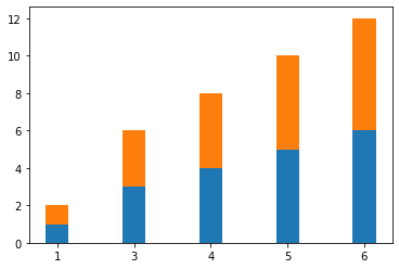
Note that in this case, we don’t have to adjust the index width of the second bar graph.
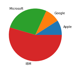
Pie Charts
To make pie charts, we use .pie() method. This method takes the following crucial parameters:
plt.pie(split_Data, labels=array_of_data_category)
For instance:
| |
([<matplotlib.patches.Wedge at 0x7f8528140400>,
  <matplotlib.patches.Wedge at 0x7f8528140940>,
  <matplotlib.patches.Wedge at 0x7f8528140e20>,
  <matplotlib.patches.Wedge at 0x7f8528151340>],
 [Text(1.0554422683381766, 0.30990582150899426, 'Apple'),
  Text(0.720346786112299, 0.8313245501834299, 'Google'),
  Text(-0.4569565739181998, 1.0005951676641962, 'Microsoft'),
  Text(-0.15654617382257757, -1.0888036073881788, 'IBM')])
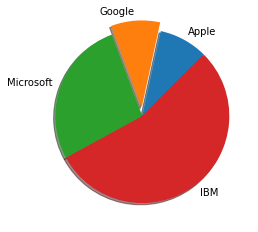
You can add further modifications of the following:
Explode, shadow, and startangle
| |
([<matplotlib.patches.Wedge at 0x7f857a7ead00>,
  <matplotlib.patches.Wedge at 0x7f857a930550>,
  <matplotlib.patches.Wedge at 0x7f857a930ca0>,
  <matplotlib.patches.Wedge at 0x7f857a93f430>],
 [Text(0.5271738771746388, 0.965446893011034, 'Apple'),
  Text(-0.08560705040249196, 1.1969425353463654, 'Google'),
  Text(-1.0306447204031748, 0.3844105361525125, 'Microsoft'),
  Text(0.659205553085804, -0.8805952752433093, 'IBM')])
Styling
First, you import style from matplotlib.
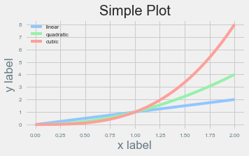
Then, you use style.use('ggplot') to implement style, before plotting. Simple.
| |
Below are a list of interesting styles: (https://matplotlib.org/stable/gallery/style_sheets/style_sheets_reference.html)
- fivethirtyeight
- ggplot
- Solarize_Light2
- seaborn
- seaborn-dark
- seaborn-deep
- seaborn-pastel
- seaborn-paper