So, going more into depth with MatPlotLib is all about learning how to style your graphs according to how you’d like them.
I’ll document some more techniques that I’ve learned here.
Creating a secondary axis
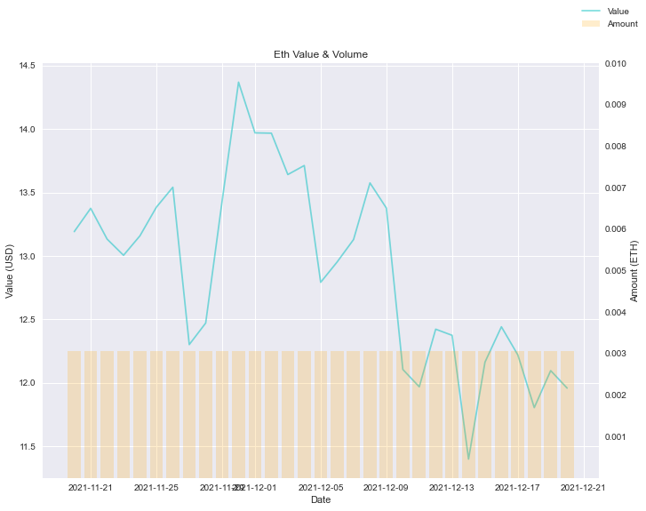
Sometimes, you need to overlay graphs. In my specific case, I needed a graph that showed both Value and Amount. My left y-axis would be the Value, whilst my right y-axis would be Amount.
It looks like this
How do I do that?
Step 1:
Use the .twinx() method on the axes.
| |
This will create a new y-axis that shares the x-axis, on the opposite side.
Step 2:
Define ax2
| |
Step 3:
Adjust the ax2 ticks to what you need.
| |
That’s it!
Changing transparency of lines
To change transparency of graph, use alpha param.
| |
Removing the grid
To remove grid, find the axes you want to target, and remove.
ax2.grid(False)
Scaling your graph (Setting ticks)
To scale your graph, you need to set ticks for the relevant axis. Use the ax.set_yticks(array) method to set the ticks, which has the effect of scaling your graph.
| |
Generating range of evenly spaced numbers using numpy
y_ticks = np.linspace(0.001, 0.010, 10)
This generates 10 numbers, evenly spaced between 0.001 to 0.010.
Legends for entire chart
When you have multiple axes, your legends might overlap. To have a good looking legend, you can use fig.legend()
To change position of legend, do: fig.legend(loc="upper right")
Fixing dates formatting on x-axis
The dates tend to look pretty weird due to overlaps. A quick fix is this:
fig.autofmt_xdate()
That’s it for this chapter.