Flexboxes are getting more and more important in designing responsive web pages. In my case, I need it to help design my left navigation bar for my app. Here are some notes taken from the video below for reference.
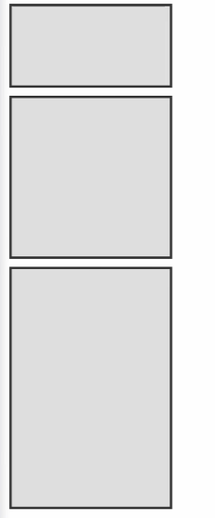
Containers and items without flex
Below is the HTML and CSS:
| |
| |
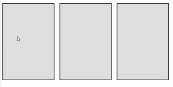
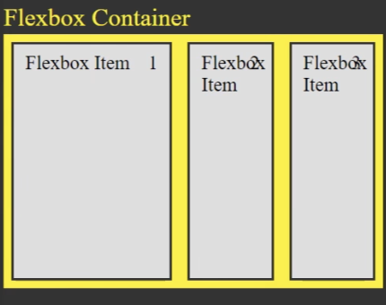
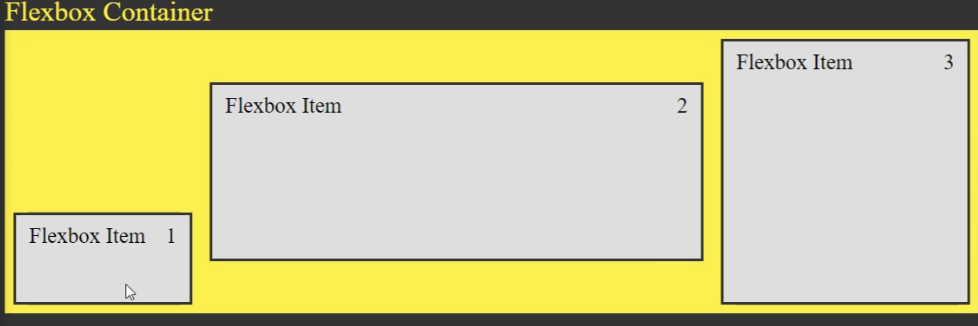
Flex container: display:flex
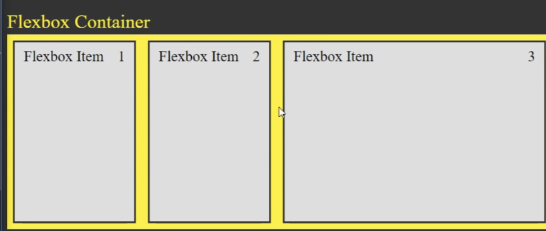
When we add the following line:
| |
All the items are distributed evenly across the page.
The main thing about Flexboxes is that..
It allows you to style the flexibility and sizing of different elements in the container from the container selector without ever having to style the flexbox items.
Most of the time, you will be laying out different elements and aligning them across the container. You also specify how they grow and shrink inside the container.
Alignment: justify-content:center
Within the container selector, you can add justify-content:center to center the elements.
| |
If we want to lay out items with space between them, we can use justify-content: space-between. The output: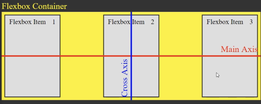
justify-content:space-around puts an even amount of space on all sides of flex items.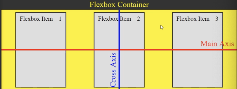
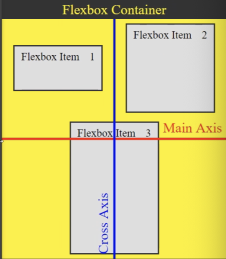
Changing direction: flex-direction:column
flex-direction: column
Just adding this at the top cos this is one of the most used. It changes your items from horizontal to vertical. Good for left nav bars.
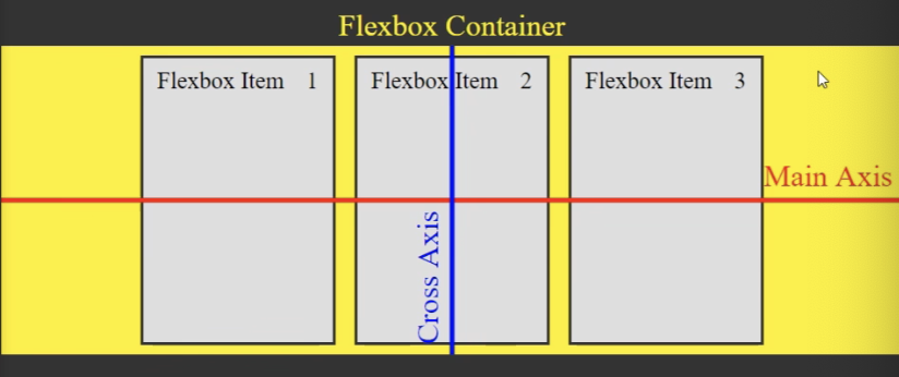
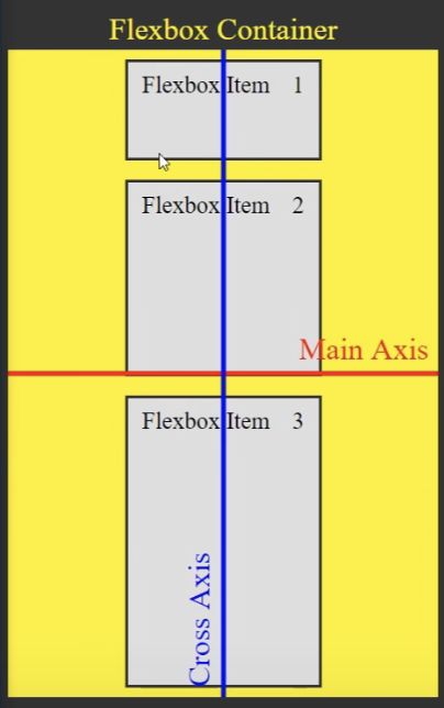
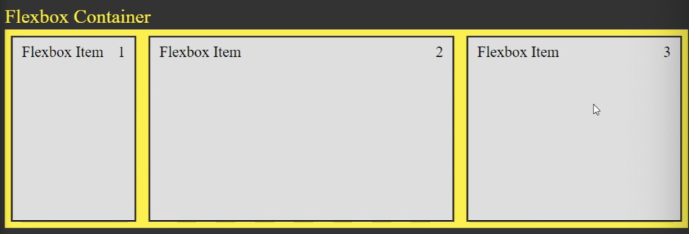
Growing / Shrinking items align-items:stretch
By default, the container selector has align items: stretch applied to it. This property will make your items ‘grow’ to full size, along the cross axis. The cross axis is defined as the direction that is perpendicular to the direction of your flex-container. e.g. if your flex is vertical, then stretch will make it apply to horizontal.
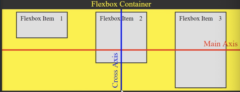
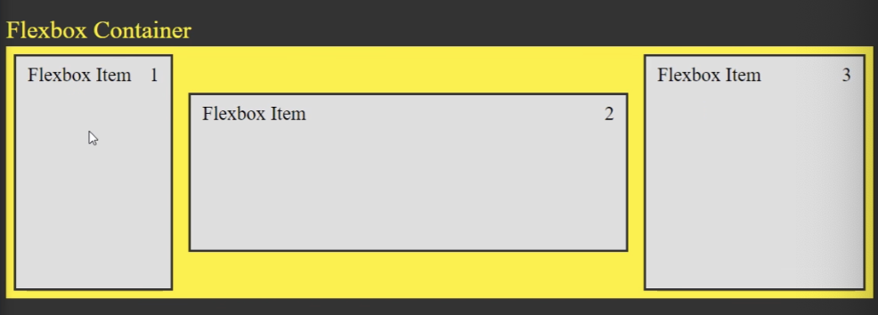
You can make them keep their original size with align-items: flex-start
align-items: flex-start
Centering items align-items:center
This is one of the most important things you can do with flexbox.
align-items: center
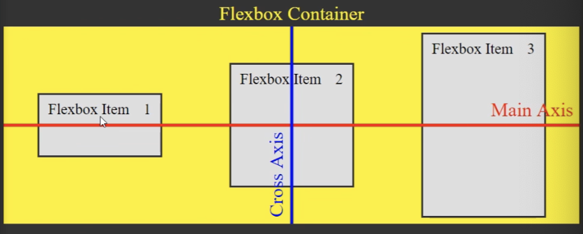
Example use case: you want all your left nav bars to be aligned along center.
Wrapping upon shrinking viewport: flex-wrap:wrap
By default, when you shrink the viewport, the flexbox items will all shrink their sizes. However, with flex-wrap:wrap within container selector, the items will wrap around one another when you shrink.
When you wrap, the align-content: center property tells it how much space to put between the lines, as well as where to place the content.
align-content:flex-end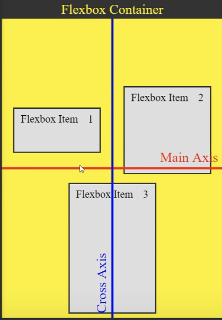
align-content:flex-start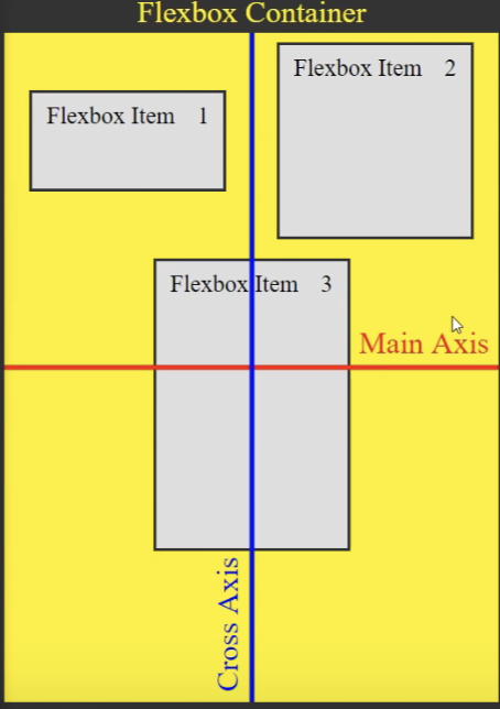
align-content:space-between
But generally, align-content isn’t used that often: justify-content and align-items will do for most of the time.
Next, you have your individual flexbox-item selectors. The properties applied here will override the container properties.
Preventing one item from shrinking flex-shrink:0
Adding flex-shrink:0 to flex-item selector will ensure that particular item doesn’t shrink when page shrinks. (Good for left nav)
Applied on first item
flex-grow: 1
This will ensure that when viewport expands, that particular item expands alongside it.
(Good for the right pane of my app)
Applied on third item
Different rates of growth
On Item 2, we have flex-grow: 2, and on Item 3, we have flex-grow: 1. When the page expands, 2 will grow at twice the rate of 3.
Aligning individual items by overriding
align-self property can be used on individual flex items to override container alignments.
| |
| |
Ordering
order property within flex-items allows us to change the order of the items without changing the html.
within flexbox-item1, order: 3; will set it all the way to the right.
But most of the time, don’t use the order property cos it messes up the flow for people using screen readers.
Shorthand for flex, shrink, grow: flex: 1 0 0px
flex: 1 0 0px
(grow, shrink, basis)