So, the thing about aping into protocols is that you don’t have to start from scratch.
It’s always a good idea to get glimpses into what the pros (whales) are doing, and ape along.
Whilst exploring Sansheets, I discovered this chart that gives me some leads in terms of which tokens are hot right now.
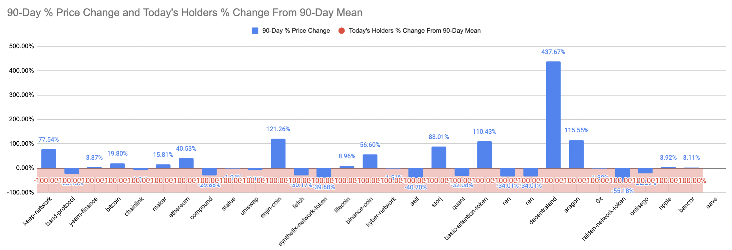
Not entirely sure how to interpret the chart (lol) but it’s good discovery for me atm.
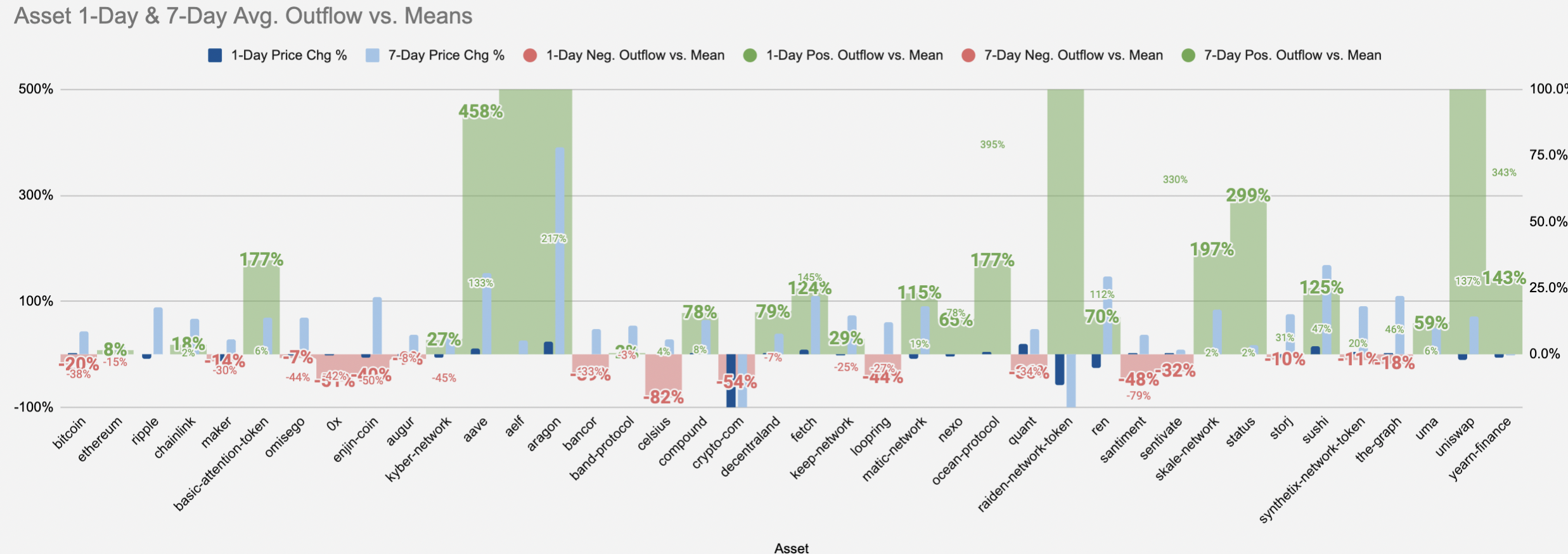
Okay so apparently, this:
Generally speaking, an asset that reveals a high exchange inflow is one that has a higher chance than normal of seeing an imminent local top. If the exchange inflow is showing lower than normal, the asset is relatively safer than usual from a big sell-off. On the flip side, if an asset has a high exchange outflow, this is generally a bullish sign, and can indicate that tokens are moving to hard or staking wallets for safe keeping, which is an indication of confidence. A low exchange outflow means that tokens are staying put on exchanges more than usual, and could be a sign of stagnancy or trader fear.
In this context: red = high exchange inflow = bearish. Green = high exchange outflow = bullish.
So in terms of aping priority, I should obviously look at the tokens with green bars.
Let’s do an analysis of Aave atm.